Time Series Analysis

Time Series Analysis
Time series analysis is a statistical technique that deals with time series data, or trend analysis. Time series data means that data is in a series of particular time periods or intervals.
We analyse time series data in order to forecast the future. Forecasting is the process of making predictions of the future based on past and present data and most commonly by analysis of trends. This could include inventory management, predicting financial market prices, analysing traffic and has several other use cases.
Time series analysis differ from Conventional Machine Learning algorithms since we use a different approach while making a model. The dataset available for Time series analysis maybe very limited compared to the data size of most of the commonly used Machine learning algorithms making forecasting even more challenging.
For example we can be asked to predict the sales of a store in the upcoming month on the basis of data of the past 3 months. This is not an easy task given the limited data but the silver lining is that we can use several time series analysis methods to do so with minimal error in forecasting.
There are three major components in time series data i.e. trend, seasonality and noise.
-
Trend : Continous increase or decrease in the series
-
Seasonality: The repeating short-term cycle in the series which can be determined beforehand by analysing past data.
-
Noise: The random variation in the series.
The most common methods used for forecasting are Autoregression (AR), Moving Average (MA), Autoregressive Integrated Moving Average (ARIMA).
Let’s do some hands-on, we’ll predict Airline passenger traffic using the popular Airline passengers dataset using fbProphet.
You can access the full notebook on my Github here.
We’ll start by importing the libraries required.
import pandas as pd
from fbprophet import Prophet
import matplotlib.pyplot as plt
plt.style.use('fivethirtyeight')
Let’s check out the dataset. This can be done in pandas using the pd.read_csv(‘filepath’) command.
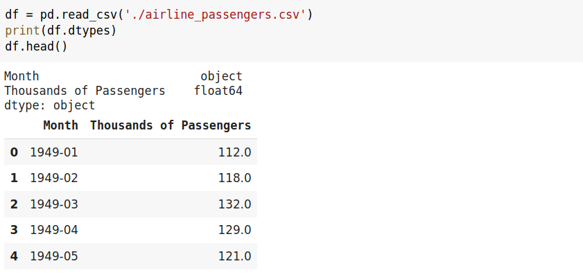
We will drop blank(Null/NaN) values using pd.dropna() where setting inplace = True will return nothing(changes are made in place ) and update the dataframe whereas setting inplace = False which happens to be the default returns a copy of the object.
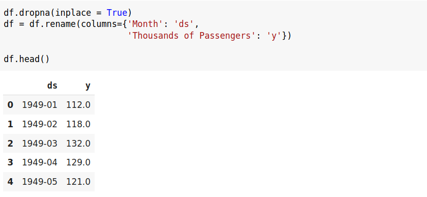
Along with this we’ll also rename the columns as ‘ds’ and ‘y’ respectively since fbProphet requires us to do so before proceeding.
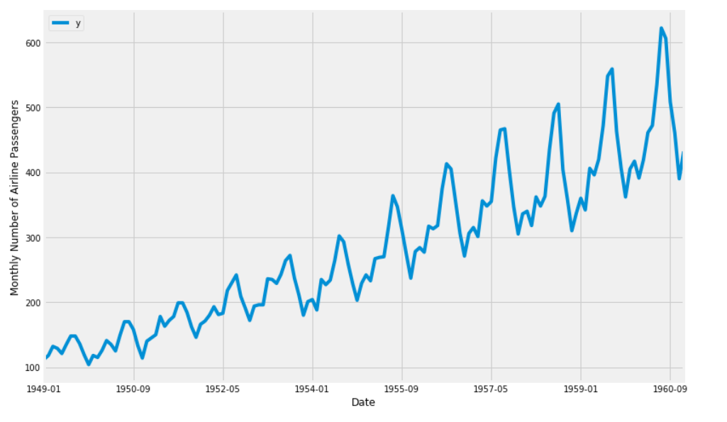
Now we’ll plot our data using matplotlib and label the axes respectively.
ax = df.set_index('ds').plot(figsize=(12, 8))
plt.ylabel('Monthly Number of Airline Passengers')
plt.xlabel('Date')

plt.show()
Now lets start training our model and for that we can use Prophet.fit(dataframe), as you can observe we have our parameter interval_width set to 0.95 which is basically the uncertainity interval for our forecast more on it’s intuition later.
my_model = Prophet(interval_width = 0.95).fit(df)
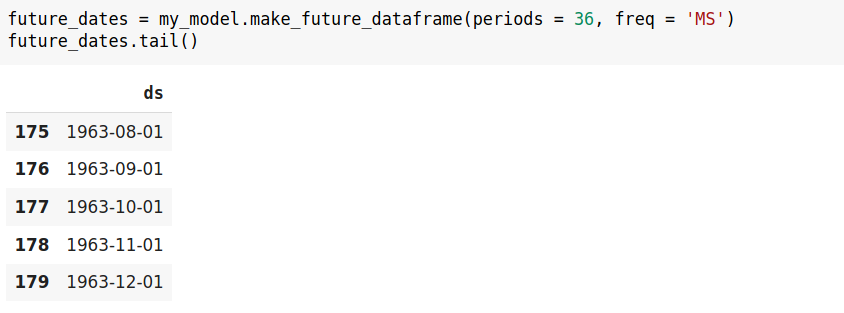
To predict passenger traffic for the future we would have to add future dates on our data. We are going to use the inbuilt make_future_dataframe function for that which takes two arguments the time frame and the frequency respectively. Here we have set periods = 36 to get data for 36 months(3 years) and frequency is set as MS to indicate monthly intervals.
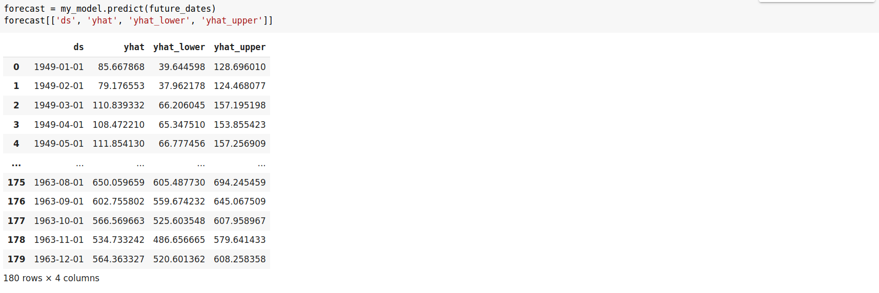
Now let’s see our forecast for the future dates. If you print forecast you’ll get a large number of columns but we’re only interested in the given columns. This would enable you to understand the intuition behind the uncertainity interval we talked about before. If you recall we had set the interval_width as 0.95 which is a high value and you can observe the margin between yhat, yhat_lower and yhat_upper columns which seems to be large given the uncertainity in the future. Now try setting your interval_width to a small value of say 0.30 and observe the difference in the margin of yhat, yhat_lower and yhat_upper you’ll see a very small margin between the values since we did not allow room for uncertainity. Since a large value for interval_width gives more flexibility for our forecast we prefer it.
Again, these intervals assume that the future will see the same frequency and magnitude of rate changes as the past. This assumption is probably not true, so you should not expect to get accurate coverage on these uncertainty intervals.
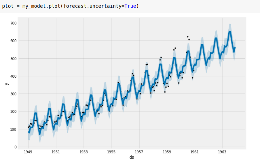
We plot our forecast and see an upward trend in the passenger traffic. It states the obvious more people started travelling through air as time progressed. You may observe some black dots and different shades of blue in the graph. The black dots account for the observed values, blue line is the predicted value whereas the shaded light blue region is the uncertainity interval. Try lowering the value of interval width and you’ll see lesser of the blue shaded region as we provide less room for uncertainity as discussed above. Regardless we do a pretty good job on the forecast.
Another awesome feature of fbProphet is that we can see the trend and seasonality of our forecast separately. There’s nothing astonishing about the trend line but the seasonality graph is quite intriguing. As you can observe the graph peaked from the month of May to mid July means we had the maximum traffic during this time of the year and hey why not it is vacation time!

We can also plot daily and weekly seasonality, consider the holiday effect in our forecasts and take into account a lot of factors in our forecast which I didn’t cover in this post just for the sake of keeping it simple. Check out the documentation for more details.
Before I conclude I would recommend you not to use this tool to predict future stock prices since markets tend to be very volatile and stock prices are governed by endless number of external factors.
In a nutshell, prophet makes the entire forecasting process easy and intuitive and provides a large variety of options.